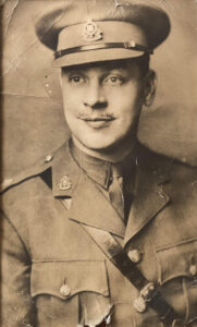
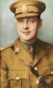
 In this restoration, I had to play detective, which was fun. The initial picture was in sepia and featured the three-quarter portrait of an army officer. Neither I nor the customer knew which branch of the army he was in. However, by tracing the badge, I was able to discover that this man was in the Royal Army Ordnance Corps.
This is important to be able to accurately colour the picture and they had to be right.
Royal Army Ordnance Corps uniform colours
So the branch of the army this man was in makes a big difference. When it comes to the colour of his uniform, as not all uniforms are the same colour. The colours of the metals in the badges and buttons are also vitally important. Producing something generic would have been easy, but would also have been too easy to get wrong.
The background here was another easy fix. With no patterns in the background to pay attention to, the background was straightforward.
 As you can see in the before image, the contrast between various aspects of the image were beginning to become a little blurred. So an adjustment of the levels was necessary to bring the vibrancy back.
Once the damages had been rectified, it was time to add the colours.
Colouring in …
People who ask for this to be done often don’t realise the work that goes into making a colour image from a greyscale or sepia image.
Firstly, each individual element has to be coloured. Secondly, the intensity of each of the colours have to be adjusted separately. This means that for every colour applied, there needs to be a colour layer. For this photo, I managed to keep it to eight. There is definitely no room for colouring in outside the lines in this!
There were definitely fiddly areas, because after all, this is someone’s family member, a serving officer of WWII and there was a definite need to ensure the photo honoured his memory.


Leave a Reply
You must be logged in to post a comment.